As Terry noted in the blog last Monday, we are in the midst of March Madness basketball. As many of you know, these 3 tournament weeks will be as much about data as basketball. ESPN and others will be crunching numbers and flashing infographics to summarize games played and predict the outcome of games scheduled.
An unattainable billion-dollar incentive drives data analysis
This year’s NCAA Men’s basketball tournament watchers will include not only the die-hard hoops fans, but also some calculating high rollers attracted by the Quicken Loans Billion Dollar Bracket: win a billion dollars for completing the perfect bracket for the 63 NCAA men’s basketball tournament games. There has never been a perfect bracket after the first round, so the odds of Quicken parting ways with a billion dollars are 1 in 9,223,372,036,854,775,808.
With some of the 15 million bracket entrants using analytics—derived algorithms to hedge bets—the billion dollar bracket may make it through the first round this year, but the Final Four perfect bracket is still a long-shot. A billion dollars, though, may be enough incentive to create a shift from March Madness to Math Madness.
A real opportunity to improve the efficiency, safety, and quality of health care drives data sharing
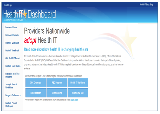
Incentives can be a big lever to change behavior and that has certainly been the belief of the government Health IT effort. Today, ONC is making it easy for us to view data on the impact of health IT dollars with the Health IT Dashboard. The dashboard has a simple homepage that provides infographics on everything from Meaningful Use to e-Prescribing patterns:
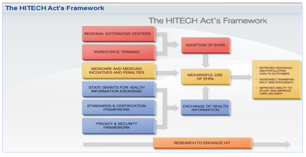
The “ONC Overview” button provides several key infographics, including a look at the ONC overall framework:
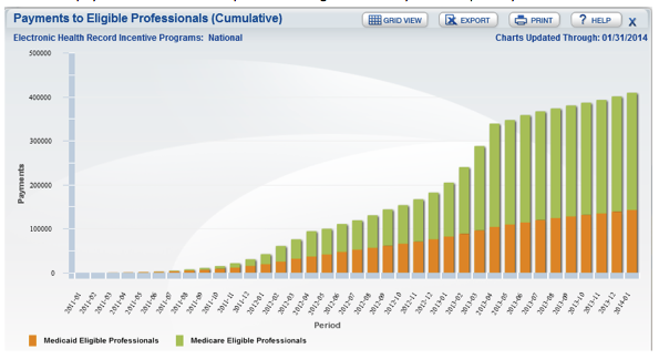
The “Meaningful Use” button on the dashboard illustrates the impact of Health IT incentives. The cumulative payment of incentives to providers has grown steadily over the past 3 years:
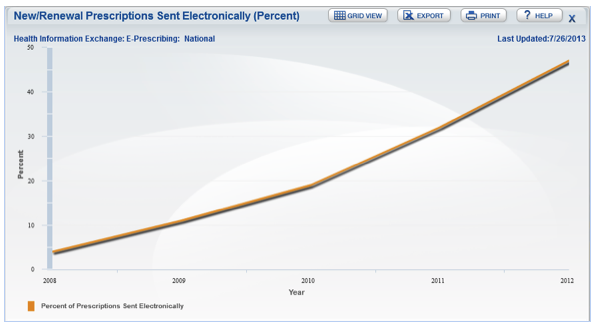
The e-Prescribing button provides data on the adoption of e-Prescribing information, from the ability for community pharmacies to accept an e-prescription to the much slower use of e-Prescribing by providers. For example, this graph of Surescripts data shows that less than 50% of prescriptions were sent electronically in 2012:
Below the main dashboard on the website homepage you will find a long list of “Quick stats,” which provide a data-rich glimpse of key Health IT milestones. Of note is “Quick stat #17,” with data on the percent of physicians e-Prescribing through an EHR. The animated version of the Quick stat #17 page provides an impressive visual representation of the increase in e-Prescribing from 7% in 2008 to 66% in 2013 across the US.
Check out the Health IT Dashboard for some good non-basketball stats this week and gain insight into ONC goals. Unlike the 3-week March Madness data blast, Health IT will be sticking around for overtime, with an even longer road to, not the Final Four, but the Triumphant Three: Health Care Efficiency, Safety, and Quality.


Leave a Reply