Spring has finally sprung here in Southside Virginia, and I hope the same has happened in your neck of the woods. Unless you’ve been stranded on a desert island for the past few weeks, you are likely aware of the Federal government’s recent release of 2012 Medicare Part B claims data. The data set is massive and it contains aggregated claims data submitted by almost 900,000 health care providers who collectively received $77 billion dollars from Medicare Part B in 2012. This month’s release was reportedly the culmination of a 30-year effort by those seeking public reporting of this information. According to the CMS press release: “Data transparency is a key aspect of transformation of the health care delivery system,” said CMS Administrator Marilyn Tavenner. “While there’s more work ahead, this data release will help beneficiaries and consumers better understand how care is delivered through the Medicare program.”
Where’s Waldo?
I would agree with Ms. Tavenner, there is certainly more work ahead! As you might imagine, the press has had a field day with this data set, with local newspapers in many cities publishing the local top Medicare “earners” in their communities. The NY Times had an early look at the data and correctly noted some of the challenges inherently present in raw claims data. Of course they provide no cautionary tales or warnings in the remarkably easy-to-use look-up tool they have posted online. If you know a doctor’s name and their ZIP Code, voila, you have their 2012 Medicare Part B payment.
Top “earners”
Docs at or near the top of the list have attracted attention. Someone had to be at the very top of the list and that distinction falls to an ophthalmologist in Florida (apparently under investigation for Medicare fraud). Who else is among the top 10 Medicare Part B providers in 2012? How about a family doc in Michigan? According to the Medicare billing data, Dr. Malouin collected $7 million dollars for services provided to over 200,000 beneficiaries in 2012. She is apparently the medical director for a large Medicare-funded medical home project. “It’s unfortunate that my name was associated with all these claims,” Dr. Malouin said. Unfortunate indeed.
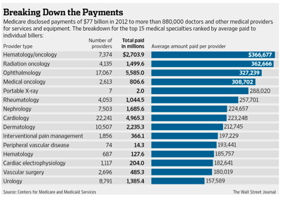
The Wall Street Journal has published some interesting perspectives related to the Medicare billing data. They have taken a look at average collections by specialty and published the table below. Notice the practice of nephrology is number 7 on the hit parade, collecting around $225,000 per nephrologist in 2012. Anything strike you as odd about this table? How about the fact that cardiology falls below nephrology? After you have finished looking yourself up in the NY Times tool referenced above, check out how your local cardiology colleagues did in 2012. I’d be surprised if they collected less than you did. However, let’s not forget the data under review is limited to Medicare Part B claims, which includes the vast majority of the country’s ESRD population.
Figure 1: Average Medicare Part B 2012 payments by specialty.
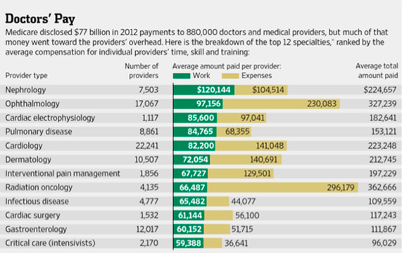
In a subsequent article, the WSJ goes a step further. They correctly point out that collections are one piece of the financial picture and they note that, as with any business, the practice of medicine involves incurring expenses as one provides care to patients. Of course they leave out the important fact that expenses are incurred well before payment is received, but that’s a story for another day. The cryptic footnote that accompanies Figure 2 in the WSJ (shown below) suggests that they have applied the work RVU component for each CPT code to define “work” and the left overs (practice expenses and malpractice components of RVU) make up the “expenses” bucket. Nevertheless, look who floats to the top of this list. That’s right, nephrologists. How will typical Medicare beneficiaries interpret this? Will they actually care? Your guess is as good as mine.
Figure 2: Average Medicare Part B 2012 payments by specialty-work vs. expenses.
Value = Quality / Cost
One of the biggest criticisms emerging as a result of this first-of-its-kind data release is the absence of accompanying quality data. One of the risks in simply releasing individual provider claims data is people focus on the amounts collected absent any measure of quality. One byproduct may be the release of polarizing pieces like this one recently published in the Daily Beast. Of course, the quality piece has not gone unnoticed, as perhaps best presented in this perspective from the Atlantic Monthly. Organized medicine agrees that supplying physician collection data in isolation presents an incomplete picture.
In fact, absent appropriate quality metrics, one could argue the 2012 Medicare billing data is of little value at best, and misleading at worst. The health care market in this country is remarkably complex and full of misguided incentives. Fee for service has long been recognized as rewarding transactions, irrespective of quality or outcomes. International comparisons of cost of care vs. quality outcomes invariably point out that we out spend every country in the world by a wide margin, but fall well short on the quality side of the health care value equation. While that may be true, as we contemplate the relevance of how much you collected from Medicare in 2012, I leave you with this intriguing perspective.
Do we get what we pay for?
As many of you are aware, the Dartmouth Atlas of Health Care has spent the last 20 years or so examining the distribution of health care resources across the country. One thing they have clearly identified is the existence of a wide range of resource utilization and cost of care across the country. What’s tougher to measure is the value delivered, where value is measured as the efficient delivery of quality (quality as a function of cost). If we spend more money for a specific service, do outcomes improve?
Joe Doyle, an economist at MIT believes the answer is yes, at least in some cases. He conducted a natural experiment that goes something like this. Let’s say you are planning a vacation in Florida. There is a decent chance that your vacation plans are made with very little consideration regarding the cost efficiencies delivered by local medical resources. Leveraging this assumption, Joe examined the health care expenses incurred by individuals vacationing in Florida who had unintended interactions with the health care system (emergencies). Using an intriguing approach he was able to compare mortality rates for folks who required emergency health care services in “high-spending” areas vs. “ low-spending” areas, areas defined much in the same way the Dartmouth Atlas defines spending. His findings? Visitors to Florida who become ill in high-spending areas have significantly lower mortality rates compared to visitors who become ill in lower-spending areas.1 (If you prefer a Cliff-notes review to the 22-page paper Joe published, I highly recommend this insightful blog post.)
Medicare billing… one small piece of the puzzle
Will the release of the 2012 Medicare billing data “help beneficiaries and consumers better understand how care is delivered” as noted earlier by Ms. Tavenner? I must admit my confidence is low. We operate within a remarkably complex health care system, one in which provider compensation for services rendered is a small piece of the puzzle. Transparency is one thing, but publishing a small slice of the cost side of the value equation, absent any reference to quality has the potential to send a very confusing message. Over the coming months we can expect to see additional movement on the transparency front. Let’s hope those releasing the data fully understand the implications.
Reference
1. Doyle, Joseph J. 2011. “Returns to Local-Area Health Care Spending: Evidence from Health Shocks to Patients Far from Home.” American Economic Journal: Applied Economics, 3(3): 221-43.


Leave a Reply